

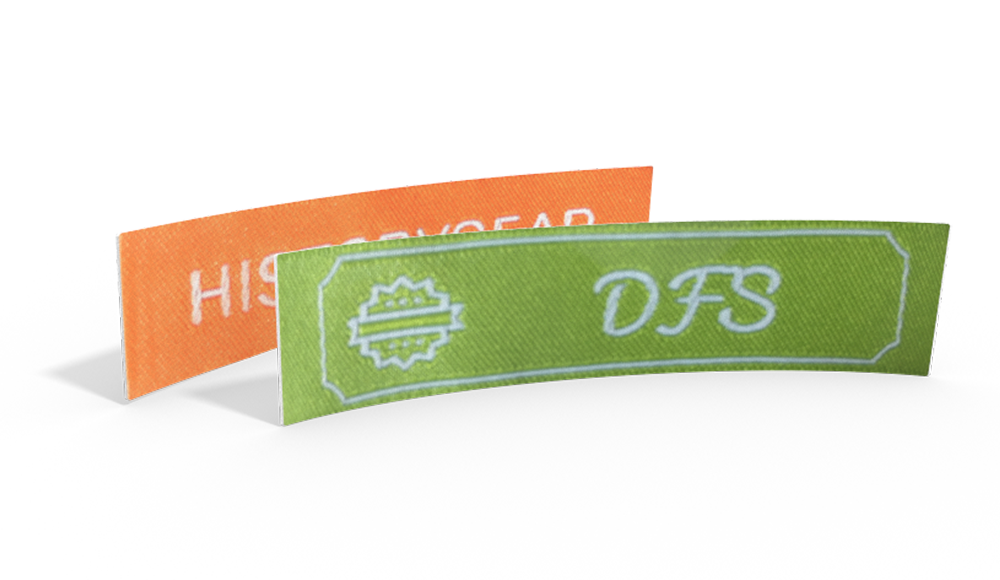
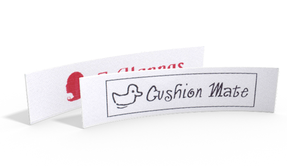
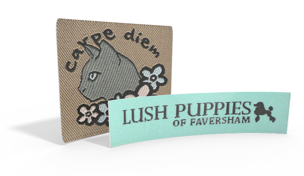
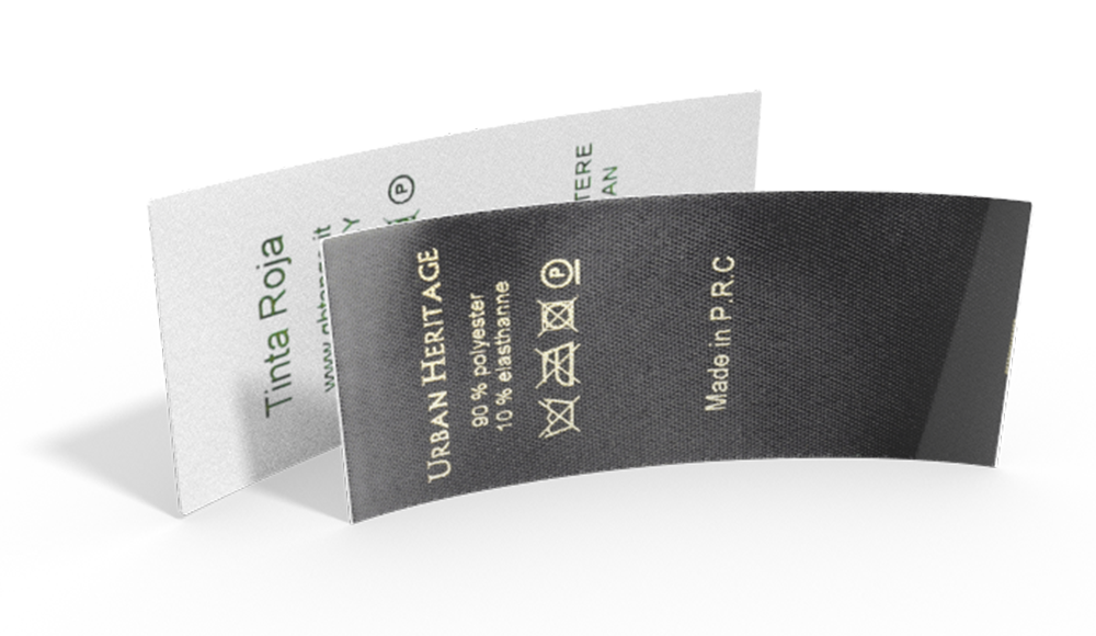
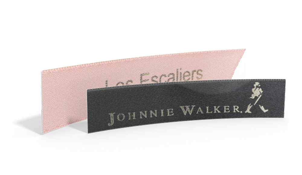
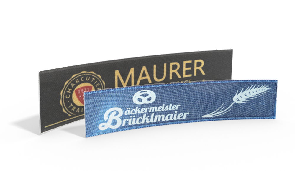
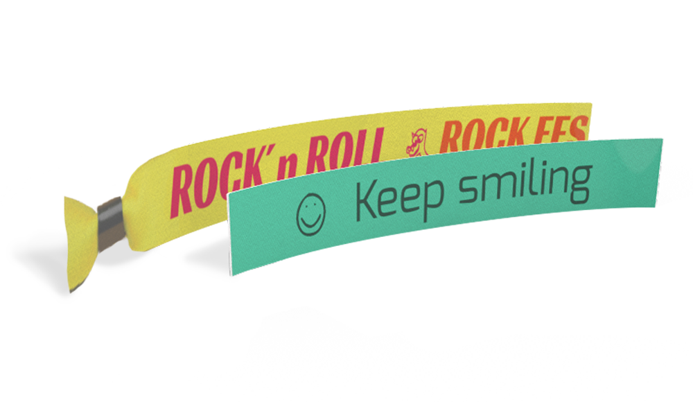


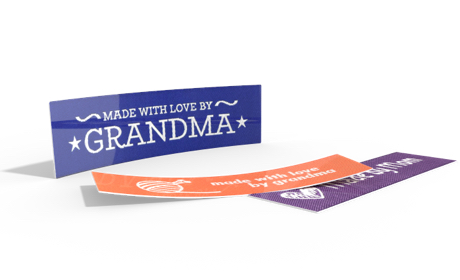


The colours of a woven label influence far more than just its design. They also determine how easily a brand name, logo or symbol can be recognised. While some colour combinations create clear, easy-to-read lettering, others can make the text almost blend into the background.
At Wunderlabel, we see every day how differently colours can look on woven labels. That’s why we’ve put together numerous examples from our configurator in this article. You’ll discover which colour combinations work particularly well, which ones are best avoided and what to consider when designing a woven label that is easy to read.
Why Contrast Is So Important
Our eyes recognise differences between light and dark areas much more quickly than differences between similar shades. That’s why contrast plays such an important role in woven labels.
Contrast directly affects how easy a woven label is to read. The greater the contrast ratio between the text and background, the more quickly viewers can identify important information. This is particularly important when using small text or fine details. A well-thought-out colour combination not only improves readability, but also gives the label a high-quality overall appearance.
Unlike printed labels, woven labels are made by weaving different-coloured yarns together. When two very similar colours meet, they can visually blend into one another. This is particularly noticeable with small text or fine symbols.
There are three main types of contrast:
Colour Contrast
Colour contrast is created by using different colours, such as red and green or blue and yellow. However, using different colours alone does not guarantee good readability.
Brightness Contrast
Brightness contrast describes the difference between light and dark colours. It is the most important factor for creating easy-to-read woven labels. White on black or black on white are therefore among the combinations with the strongest contrast.
Color Saturation
Less saturated colours, such as pastel shades, can also reduce contrast. Even when two colours differ in brightness, they often appear much more subtle than vivid ones. This can also reduce readability.
Good Color Combinations for Woven Labels
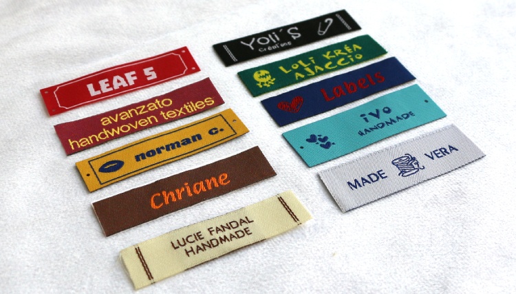
High contrast makes text and symbols easier to recognise. The following colour combinations have proven particularly effective in practice.
Colour Combinations to Avoid
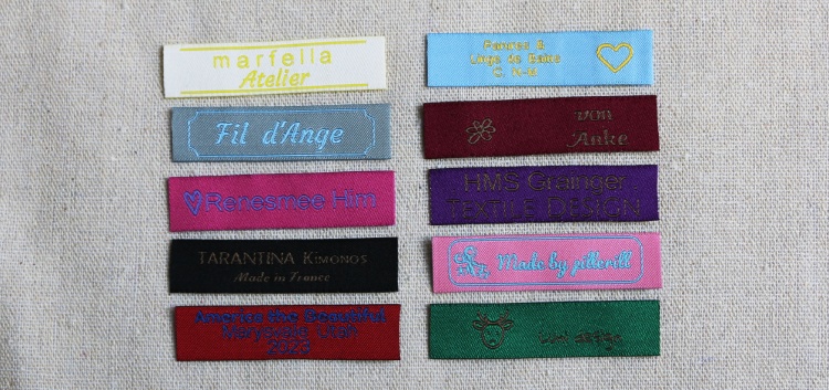
Not every attractive colour combination is equally suitable for woven labels. Combinations with low contrast in particular can make fine details difficult to distinguish.
Fine lines and details tend to disappear particularly quickly when the font size is small. Symbols also appear much blurrier if they do not stand out clearly against the background.
Special Materials Can Affect Contrast
The colours you choose are not the only factors that determine how easy a woven label is to read. The yarn used and the texture of the background can also affect how a colour combination looks.
Sparkling Yarn
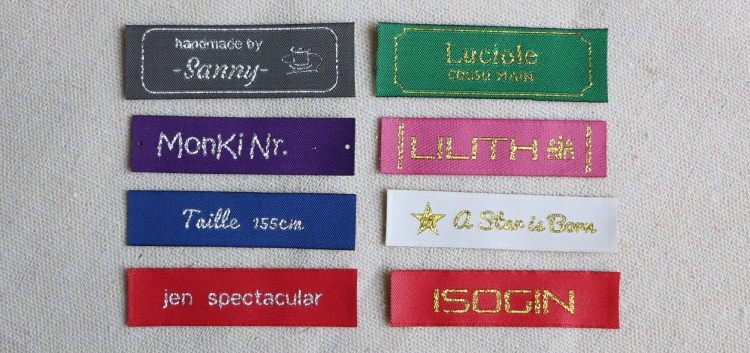
Sparkling yarn reflects light and creates a special effect. At the same time, readability depends more heavily on the background than it does with matt yarns.
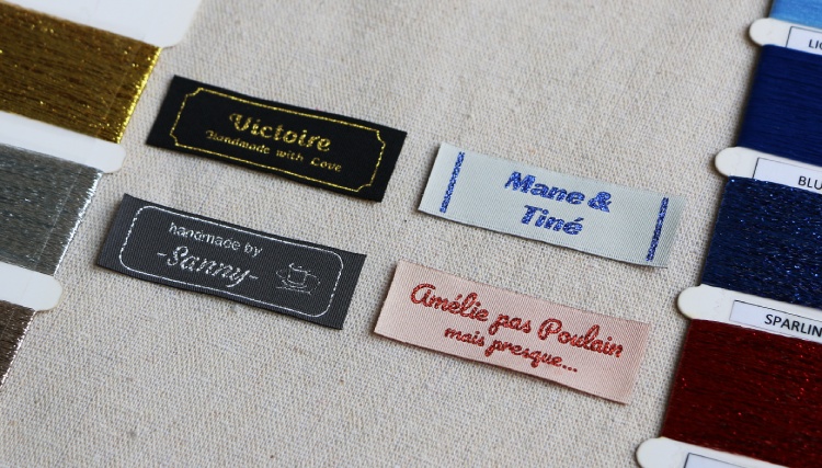
Silver or gold sparkling yarn, for example, usually provides much stronger contrast on dark backgrounds than on white or off-white.
The background colour should also be chosen carefully when using red or blue sparkling yarn.
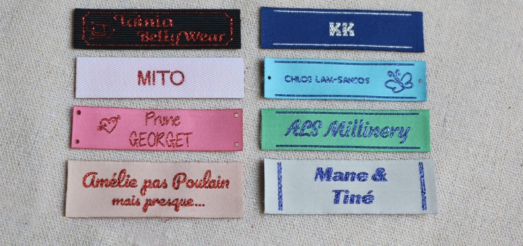
Tip: It is best to use silver and gold on dark labels. With sparkling blue and red, make sure there is a strong brightness contrast.
Textured Woven Labels
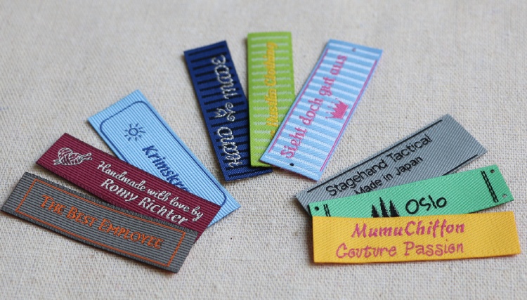
For woven labels with a vertical texture, the background consists of narrow, two-colored stripes. This makes the background look more dynamic than a single-colour surface.
The lower the contrast between the text and the two background colours, the more the lettering can visually blend into the texture.
Tip: Choose strong contrasts for textured labels wherever possible and avoid similar shades. You can find more information about striped labels in our blog post ‘Custom Textured Labels – Options & Uses’.
Small Text Needs More Contrast
The size of the text has at least as much of an impact on readability as the choice of colour.
While large letters can still be easy to read with slightly lower contrast, smaller text requires significantly greater differences in color. The same applies to delicate typefaces with thin lines.
Our tip: If you choose a more subtle colour combination, opt for a larger or bolder font wherever possible.
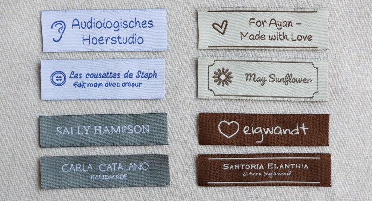
Symbols Need Contrast Too
It’s not just text that benefits from high contrast.
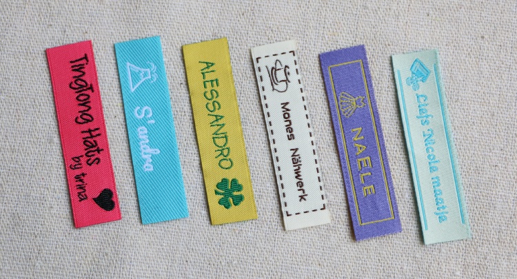
Small hearts, stars, flowers, logos and other graphic elements can also quickly lose definition if they are too similar in colour to the background.
The more delicate a symbol is, the more important a clear contrast becomes.
What Effect Do Different Colours Have?
As well as affecting readability, your choice of colour also influences the overall impression of a label. Depending on the combination, a design can look modern, natural, sophisticated or playful.
Black looks elegant and modern, while white creates a simple, timeless look. Off-white has a natural and understated feel, while brown is reminiscent of handmade products and a rustic style.
For a sophisticated, classic look, blue is a great choice. Red is bold and lively and quickly draws attention. Pink creates a playful, friendly feel, while gold conveys an elegant and exclusive impression.
These colours offer plenty of design possibilities and can be combined in different ways depending on the desired effect. However, it is important to ensure that there is sufficient contrast between the background and text.
Which Yarn Colours Are Particularly Popular?
The choice of yarn colour also plays an important role when designing custom woven labels. A look at the most popular colours in our configurator shows that white, blue and turquoise are among our customers’ favorites. Off-white and black are also frequently chosen, while apple green is another popular option.
The right colour depends entirely on the look you want to achieve. White and off-white have a simple, understated feel, while blue is versatile and can create a classic, sophisticated impression. Turquoise and apple green bring more colour to a design and create a fresh, lively look. Black, on the other hand, is a timeless classic and works particularly well with light-coloured yarns.
Ultimately, the best colour for your design depends on the effect you want to achieve and how it works with the text colour. Sufficient contrast ensures that your custom woven label not only looks great, but is also easy to read up close.
How to Test Your Colour Combination in the Wunderlabel Configurator
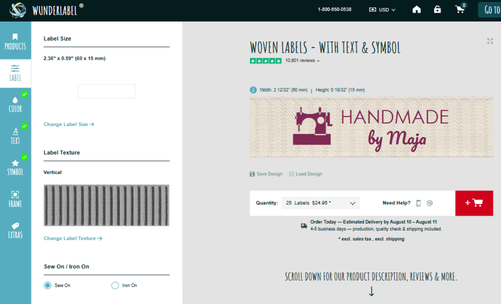
You can use the configurator to check how easy your design is to read in just a few simple steps.
✔ Try out different background colours.
✔ View your label at a smaller size too.
✔ Make sure that the text and symbols stand out clearly from the background.
✔ Always assess the text and symbols together.
✔ When in doubt, a simple, high-contrast combination is usually the better choice.
Also bear in mind that colours on screen may differ slightly from the finished woven product. Sufficient contrast ensures that your label remains easy to read.
Our Recommendations at a Glance
✅ These Combinations Offer Good Contrast
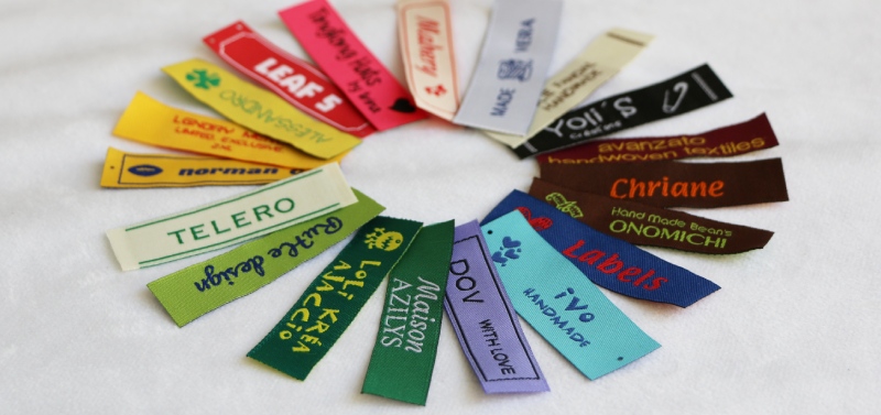
- Red + White
- Bordeaux + Yellow
- Yellow + Blue
- Brown + Orange
- Off-white + Brown
- Black + White
- Green + Lemon
- Blue + Red
- Light Blue + Blue
- White + Blue
- Purple + Black
- Off White + Green
- Apple Green + Blue
- Yellow + Red
- Yellow + Green
- Magenta + Black
These Combinations Can Affect Readability
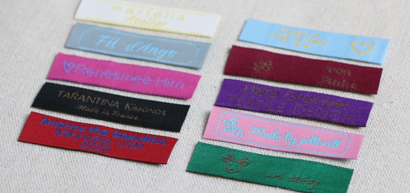
- Off-white + Yellow
- Silver Grey + Light Blue
- Pink + Purple
- Green + Blue
- Black + Brown
- Green + Red
- Red + Blue
- Emerald + Yellow
- Bordeaux + Light Brown
- Light Blue + Yellow
- Dark Purple + Light Brown
- Pink + Light Blue
- Green + Brown
Conclusion
Good readability starts with the right colour combination. The more clearly the background and text stand out from each other, the easier it is to recognise a brand name, logo or symbol.
Not every visually appealing colour combination is equally suitable for woven labels. Similar colour and brightness values in particular can cause fine details to get lost in the weave.
With a few simple principles – sufficient contrast, an appropriate font size and careful colour selection – you can create a woven label that not only looks great, but also remains highly readable once woven.
FAQ
What is the best colour combination for a woven label?
High-contrast combinations such as black and white, red and white, or white and blue make text and symbols easier to recognise. The right combination also depends on the overall look you want to achieve.
Which colours should I avoid combining on woven labels?
Colour combinations with little contrast can make text and fine details difficult to read. Similar light or dark shades, such as silver grey and light blue or green and brown, can blend into each other.
Does the font size affect the readability of a woven label?
Yes. Small text and thin typefaces need more contrast to remain easy to read. If you choose a more subtle colour combination, a larger or bolder font can help improve readability.
How can I check if my woven label colours have enough contrast?
You can test different background colours in the Wunderlabel configurator and view your label at a smaller size. Make sure both the text and symbols stand out clearly from the background, and remember that colours on screen may differ slightly from the finished woven label.


